Sonixd-Redux
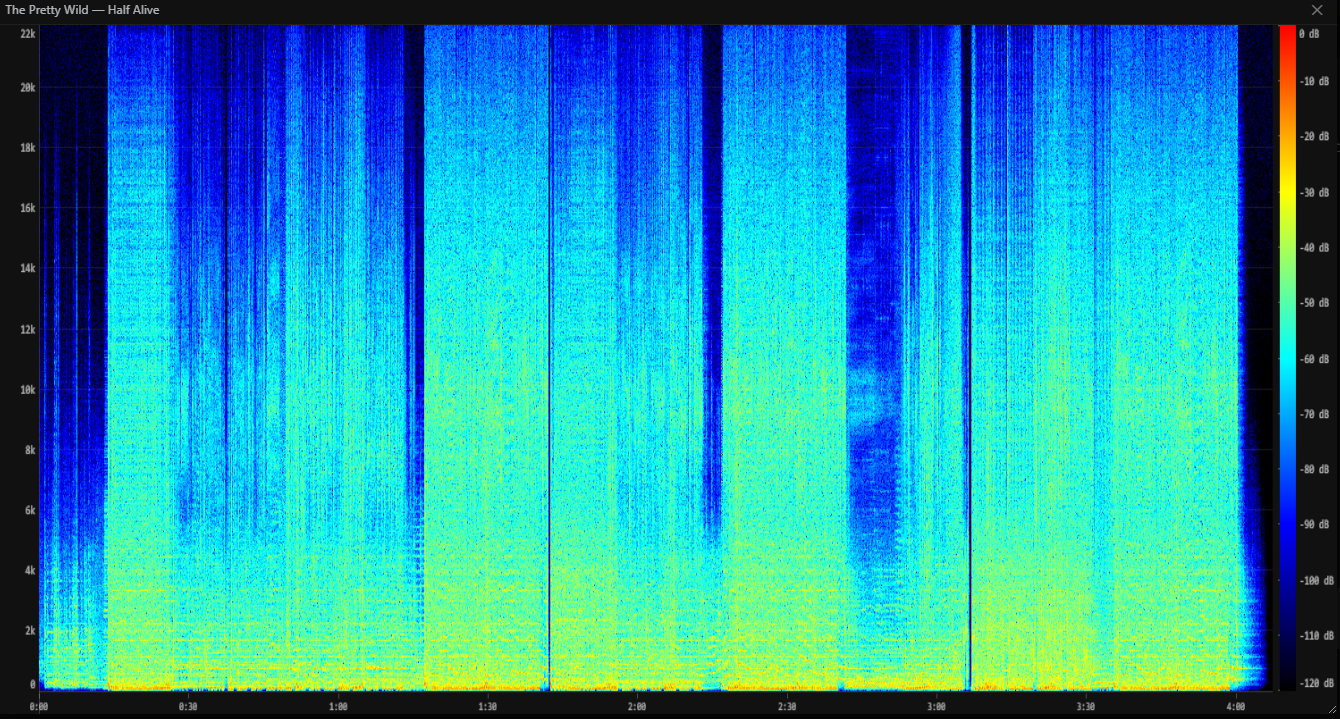
Spectrogram
The spectrogram viewer lets you see the full frequency content of any song as a colour plot - useful for checking audio quality, identifying encoding artefacts, or just exploring what a track looks like.
Opening the spectrogram
Right-click any song in any list view and select Show spectrogram from the context menu.
Sonixd Redux downloads the full audio file from your server and analyses it locally. While the analysis runs, the modal shows “Analyzing audio…“ - this typically takes a few seconds depending on track length and your server speed.
Reading the display
The spectrogram maps three dimensions onto the canvas:
| Axis | What it represents |
|---|---|
| Horizontal | Time (left = start, right = end) |
| Vertical | Frequency (bottom = 0 Hz, top = nyquist) |
| Colour | Loudness at that frequency and time |
Colour scale
The colour runs from black → blue → cyan → green → yellow → red, covering a range of -120 dB to 0 dB:
| Colour | Level |
|---|---|
| Black | Silence (≤ -120 dB) |
| Blue | Very quiet |
| Cyan / Green | Moderate |
| Yellow | Loud |
| Red | Very loud (near 0 dB) |
A reference gradient bar with dB labels is shown on the right side of the plot.
Axes
- Frequency axis (left) - linear scale from 0 Hz at the bottom to the track’s Nyquist frequency at the top (typically 22 kHz for 44.1 kHz audio). Grid lines and labels mark every 2–5 kHz depending on the sample rate.
- Time axis (bottom) - labelled in M:SS format with tick marks every 15–120 seconds depending on track length.
Interpreting the spectrogram
A few things to look for:
- Hard cutoff at a low frequency (e.g. everything above 16 kHz is black) - the audio was likely transcoded from a lossy format like MP3 at a low bitrate.
- Broad energy across the full spectrum - uncompressed or high-bitrate audio with no cutoff.
- Horizontal banding - harmonic content, common in vocals and instruments with a clear pitch.
- Vertical streaks - transients such as drum hits or clicks.
Window controls
- Resize - drag the bottom-right corner to make the window larger or smaller.
- Close - click the ✕ button or click anywhere outside the modal.